article thumbnail

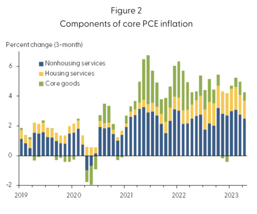
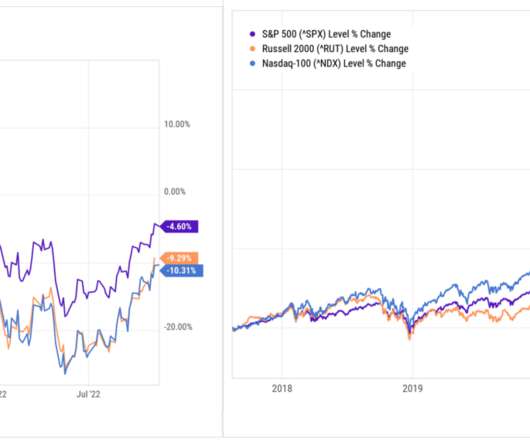
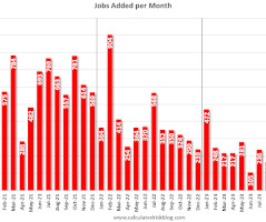
Where is This Rally Going?

The Big Picture

The Pandemic crash and rally was a 34% reset and a continuation of the bull that formally began in March 2013. Not So Fast (April 3, 2020) Redefining Bull and Bear Markets (August 14, 2017) Secular market cycles reflect geo-political, economic and technological issues of era (November 15, 2014) Is the Secular Bear Market Coming to an End?

Taxes 276
article thumbnail

Top 0.1%: How Much Wealth Does It Take?

The Big Picture

I was working on a longer piece about which economic strata the Fed has the greatest impact on (its more complicated than you might think) when Invictus DM’d me this amazing FRED chart. Wages in America (2013-2021). We looked at this idea earlier this year , but it’s worth revisiting. The Fred Blog, December 5, 2022.

Insiders

Sign Up for our Newsletter

This site is protected by reCAPTCHA and the Google Privacy Policy and Terms of Service apply.

article thumbnail

2% Inflation Target is Silly

The Big Picture

Laurence Ball, Professor of Economics at Johns Hopkins and Research Associate at the National Bureau Of Economic Research, made the case in 2013 that 4% was a more rational target. The case for 4% inflation , Laurence Ball, VoxEU/CEPR 24 May 2013 3. Peasants: We have found a witch! (A a witch!)

Economy 246
article thumbnail

Are Labor Costs Driving Inflation? (No)

The Big Picture

Regardless, credit Adam Hale Shapiro, a senior economist in the Economic Research Department of the Federal Reserve Bank of San Francisco, for calling out that his boss is wrong about this issue… Source : How Much Do Labor Costs Drive Inflation? ( No) appeared first on The Big Picture.

Economics 306
article thumbnail

Countertrend ?

The Big Picture

The best examples are 1946-66, 1982-2000, and 2013 forward. for this to be the case two things must have happened: 1) The secular bull market that began in 2013 has ended, and 2) We are now in a new secular bear market. We call these eras Secular Bull Markets.

Economy 321
article thumbnail

Wealth Inequality Starts at the Top

The Big Picture

Source: FRED Wealth disparities get ever more lopsided the higher up the economic strata you climb; there is more disparity with the top 1% than the top 10%, but the biggest spreads are at the top 0.1% (and above). Consider the chart at top, created by Invictus via FRED.

article thumbnail

What Else Might be Driving Sentiment?

The Big Picture

I run through 30 charts in 30 minutes that explain where we are in the economic cycle, what markets are doing, and what it means to their portfolios. One of my favorite responsibilities as chief investment officer at Ritholtz Wealth Management is the quarterly conference call I do for our clients. 2 Regardless, something is amiss.

Media 350