My Favorite Charts
The Irrelevant Investor
JANUARY 3, 2018
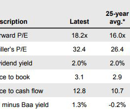
There is so much amazing information out there that it's just impossible to read it all. So every time J.P. Morgan updates their Guide to the Markets, I skim the first 20 or so and then give up. But this year I went through all of them and picked out my favorite slides, for your viewing pleasure. 1. It's pretty wild that the CAPE has averaged 26.4 (long-term average 16) for the last 25 years, especially when you consider that we had two 50% crashes.


Let's personalize your content