
The September Federal Reserve meeting is behind us we still have November and December ahead of us. Markets are nervous expecting another hike before years over and two cuts in 2024. My advice: ignore those expectations as they have been wildly inaccurate over the past few years; they have been mostly inaccurate over the past decade.
When it comes to forecasting economic outcomes, the Fed is no better or worse than anybody else.
I know of no better authority to cite than Federal Reserve Chairman Jerome Powell, from his June 16, 2021 presser:
“The dots are not a great forecaster of future rate moves. And that’s not because—it’s just because it’s so highly uncertain. There is no great forecaster of the future—so dots to be taken with a big, big grain of salt.”
What makes the Fed a little different is that they make these forecasts very publicly and maintain an ongoing record of their history for posterity. They may be terrible economic forecasters but give them credit for not burying those bad predictions like so many on Wall Street do. And please credit Powell for admitting what so many other economic prognosticators fail to do: Own up that they do not know what will happen in the future.
To wit: The Dot Plot.
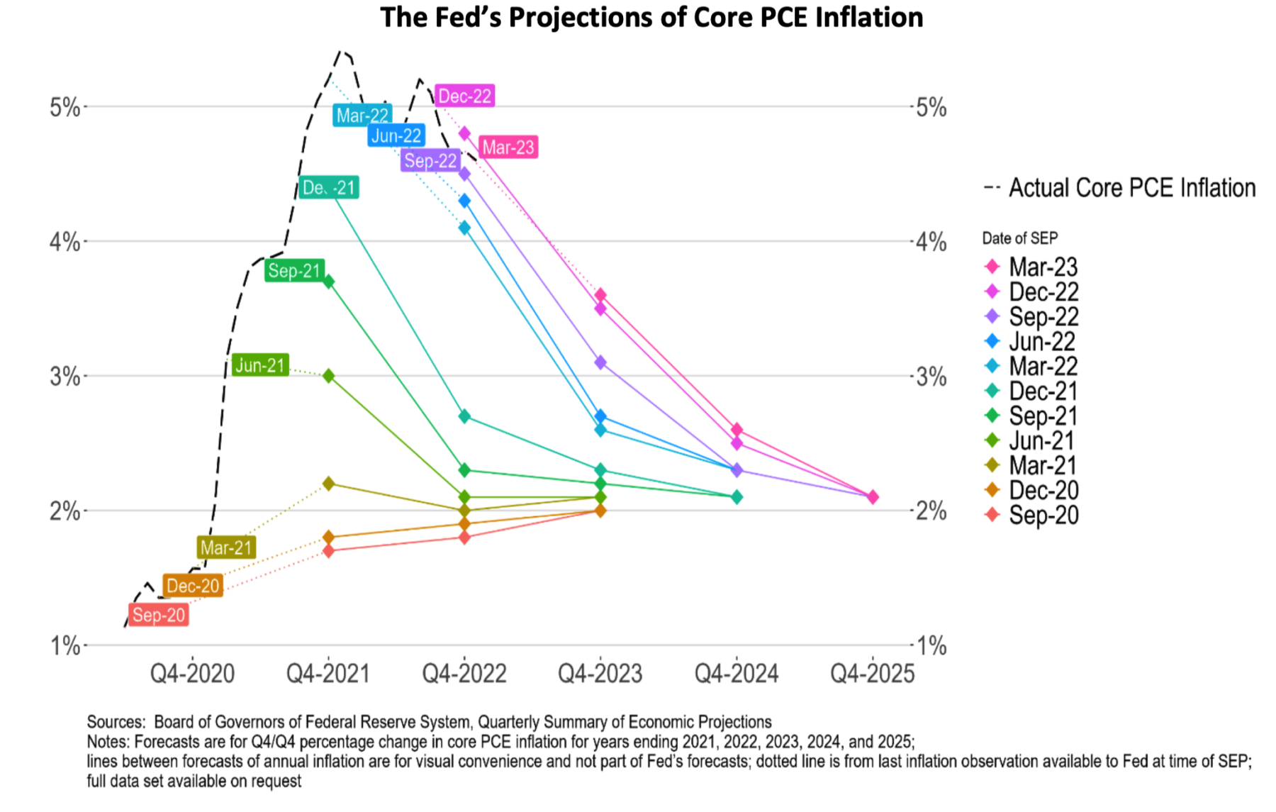
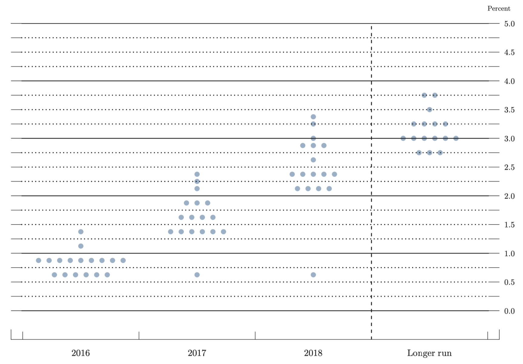
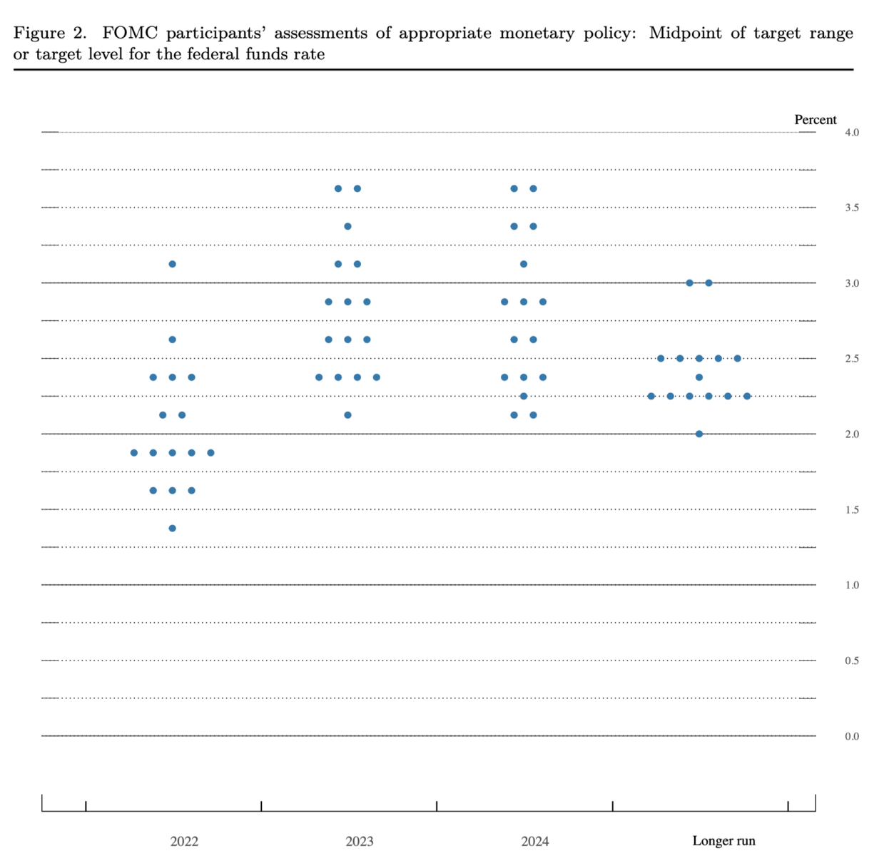
As the Chairman noted, the dot plot is simply a chart showing each Federal Reserve member’s projection for the Fed funds rate over the next few years. Each dot corresponds to a policymaker’s expectations of future interest rates. While they may not be official forecasts, they do show what individual FOMC members are thinking. The substantial changes from one meeting to the next reveal just how volatile economic data can be, especially when it comes to CPI.
Go to the Fed’s website, and search for “Summary of Economic Projections.” These are the quarterly summations that include the dot plots within them. Randomly grab a few, and scroll to the 4th to 8th pages or so to find the dot plots. Then compare them to what actually occurred, via the FOMC’s target federal funds rate or range, change (basis points) and level.
The economic seriousness here should prevent you from thinking “Hilarity ensues.”
Here are the June 2016 dot plots:
Fast forward to September 2021, where the Fed imagined 2023 fund rates to be around 1%: 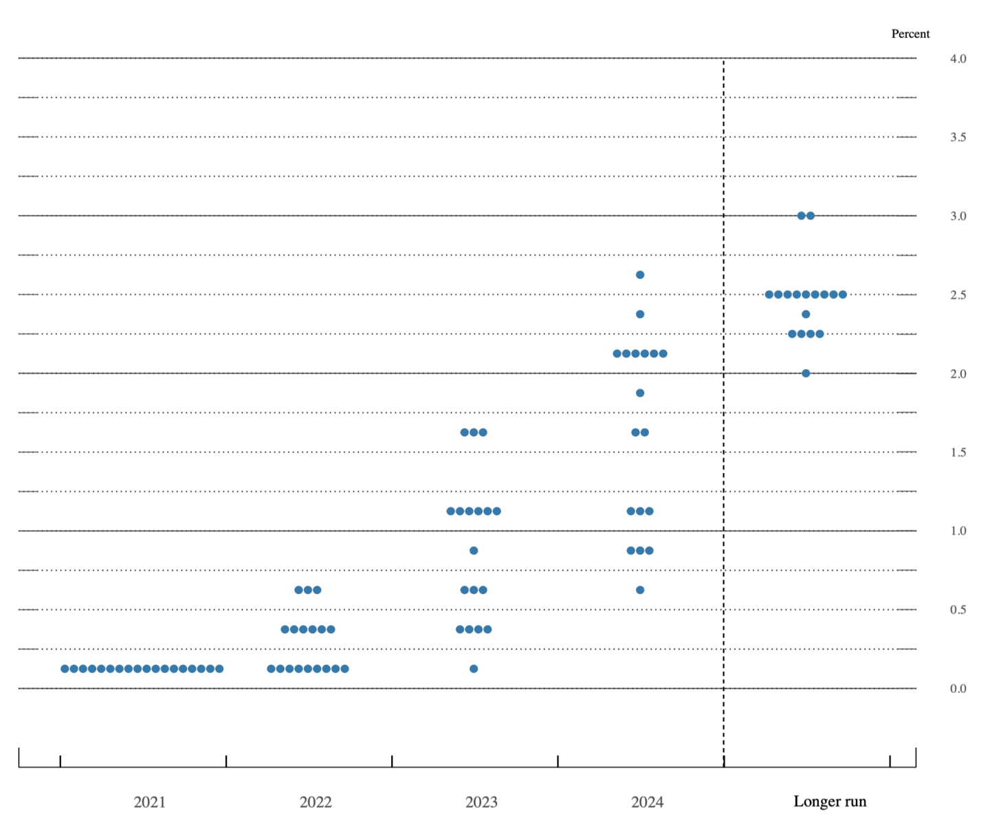
Now, March 2022 dots imagined a year later we’d be about 3%:
Last, the current September 2023 Dot Plot, which I guess is comforting(?) as the out years are now trending downwards: 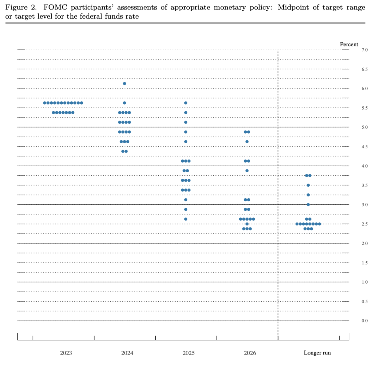
The dots are useful to give Fed watchers something to talk about, but for the rest of us, it is really a humbling reminder that nobody knows what the future holds. As much as people criticize the Fed, I give them credit for saying what they’re going to do and then doing it. And again, kudos to them for admitting they can’t see the future.
Now if we can just get them to understand the present, maybe we’ll be OK…
Update: 1:32 pm
My pal Rosie shares the following info from his 2022 discussion of the first FOMC increase:
“Needless to say, I am skeptical of the Fed’s forecasts, even though investors treat them (and the dot-plots) as gospel. Look at the accuracy of the Fed’s forecasts (a total of 110 data-points back to 2012)”
- Fed funds rate: accurate 37% of the time
- Core inflation: accurate 29% of the time
- Unemployment rate: accurate 24% of the time
- Real GDP growth: accurate 17% of the time
-David Rosenberg
Previously:
Five Ways the Fed’s Deflation Playbook Could Be Improved (Businessweek, August 18, 2023)
Why Is the Fed Always Late to the Party? (October 7, 2022)
Who Is to Blame for Inflation, 1-15 (June 28, 2022)
Nobody Knows Anything (Collection)
See also:
Powell’s Taper Tightrope Could Be Complicated by Fed ‘Dots’ (WSJ, Sept. 21, 2021)
The Federal Reserve’s latest dot plot, explained (BankRate September 20, 2023)
The Fed and its Dots lavish portrait (James Lavish, Dec 18 2022)
The Fed ‘Dots’ Put Financial Markets In A Tizzy (Forbes 6/19/21)
