

Interest Payments Are An Increasingly Large Part Of The US Budget Deficit
The Big Picture
NOVEMBER 6, 2023
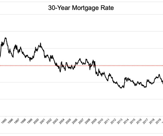
If you were in Congress from 2015-2021, you are the reason why HALF of the projected federal debt will soon be interest payments. Source: Chartr We talked about this 2 weeks ago , but the nation missed a fantastic opportunity to refinance all of the outstanding US debt at much lower levels.


Let's personalize your content